Mapping the language of Earth from orbit to delivery
Maps were designed to serve a specific user context, from clean operational basemaps for field operators to high-contrast overlays that allowed customers to comprehend data & story. We desired to build a mapping system that existed in many spaces; from platform to custom delivery of insights in a variety of delivery methods.
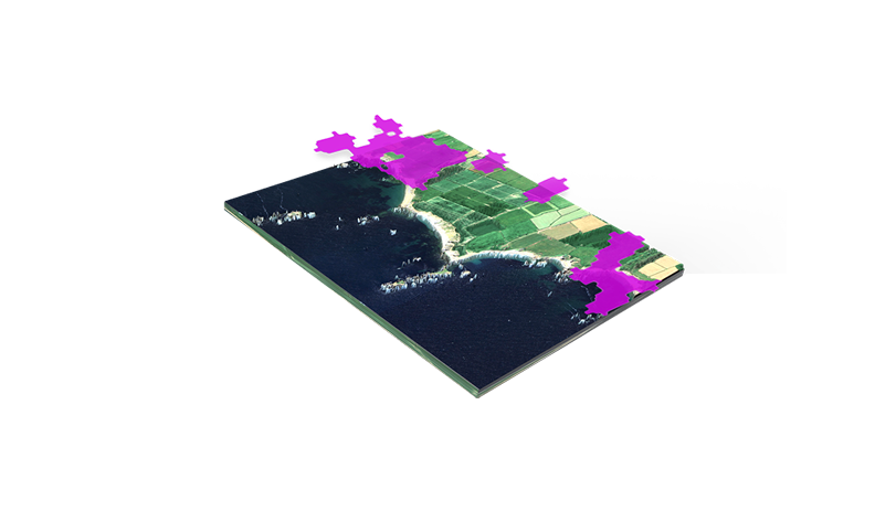
2D Maps - Visual Language & Standards
Designing a Map System for Mission Success
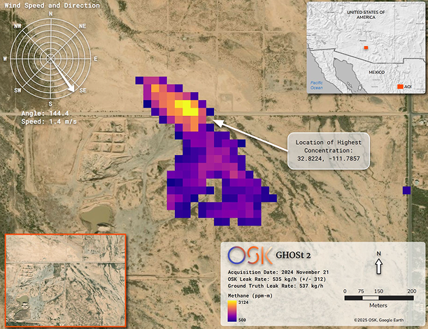
Map produced and audited in ArcGIS Pro, QGIS, and other analytic automation tools.
2D Map Components
- Location Inset
- Analytic Overlay
- Wind Rose
- Satellite Detail View
- Map Info & Legend
- Scale
- North Arrow
The Visual Language
Rather than designing maps ad hoc, we established a formal system: color palettes, typography at scale, layer ordering rules, and overlay conventions that teams across engineering, science, and sales could use.
Dimensions
- 1920 × 1080px — presentation
- 300 DPI — print export
- 2048px max — web/platform
File Types
- PNG, PDF - deliverables
- GeoTIFF, ENVI - spectral
- OBJ - 3D terrain
Units
- Metric (km) - scale bars
Challenge
Complexity without chaos! - OSK Analytics Team
Hyperspectral data is inherently dense. Building maps that surfaced the right insights across basemaps, overlays, and surfaces, without overwhelm, was the central design problem.
Impact
Investing in the future
Map produced under these systems appeared in TechCrunch, AWS case studies, SpaceNews, NVIDIA, and research presentations; as well as in pitch decks, sales material, and customer deliverables.
Automated Map Generation System (AMGS)
Scripted Intelligence, Designed For Delivery.
An internal script and tooling pipeline was built to automate the compositing of design assets directly onto 2D maps. Metadata from OSK's hyperspectral findings, including wind speed and direction, leak rate, ground truth leak rate, and acquisition date, were programmatically overlaid onto georeferenced imagery, producing client-ready deliverables without manual design work per output.

🤖 Delivery Automation Workflow
Map Specifications
Standards that governed every output
Every map produced at OSK, whether a client deliverable, platform view, or pitch deck asset, was governed by a shared set of technical standards. These ensured consistency across teams, tools, and formats.
Canvas & Dimensions
- Presentation1920 × 1080px · 16:9
- Print export300 DPI minimum
- Web / platform96 DPI · max 2048px
- Square format1080 × 1080px · social
Projection & Scale
- Coordinate systemWGS-84
- Platform projectionWeb Mercator · EPSG:3857
- Deliverable projectionUTM zone-specific
- Scale barsMetric (km) primary
File Formats
- Client deliverablesPNG · PDF
- Spectral overlaysGeoTIFF · ENVI (.hdr)
- Platform basemapMapbox GL JSON
- 3D terrainOBJ + georef metadata
Color & Typography
- Color modelCIELAB · perceptually uniform
- Map labelsInter · min 10pt at export
- Brand lockupRequired on all external maps
- Layer orderSpectral above basemap always
Required Map Elements
- North arrowAll external deliverables
- Scale barAll external deliverables
- Location insetRegional context required
- Acquisition dateAll spectral outputs
Toolchain
- PlatformMapbox GL JS
- AnalysisArcGIS Pro · QGIS
- AutomationPython · Matplotlib · GeoPandas
- 3D renderingBlender · Three.js
Principles
Design Rules that held the system together
01
Tell the Right Story
Every map element had to earn its place. Default views don't show what industry operators truly need. Visualizations, elements, and the basemap had to tell the right story for the right solutions; allowing customers to Know Now & Act Fast!
02
Get to the Useful
OSK's customers operate in high-stakes environments where time is a constraint and clarity is currency. The maps were not decoration; it was the decision. Designed to uphold operational integrity and guide customers from uncertainty to action, every layer, label, and overlay was a deliberate step forward.
03
Export & Share Ready
All maps had to be able to be shared amongst a variety of formats. Customers own workflows and environments often times shared maps in different mediums. Ranging from E-Mail, PDF Reports, and Slide Decks.
3D Maps for Spatial Storytelling
From Orbit to Boardroom to Real World
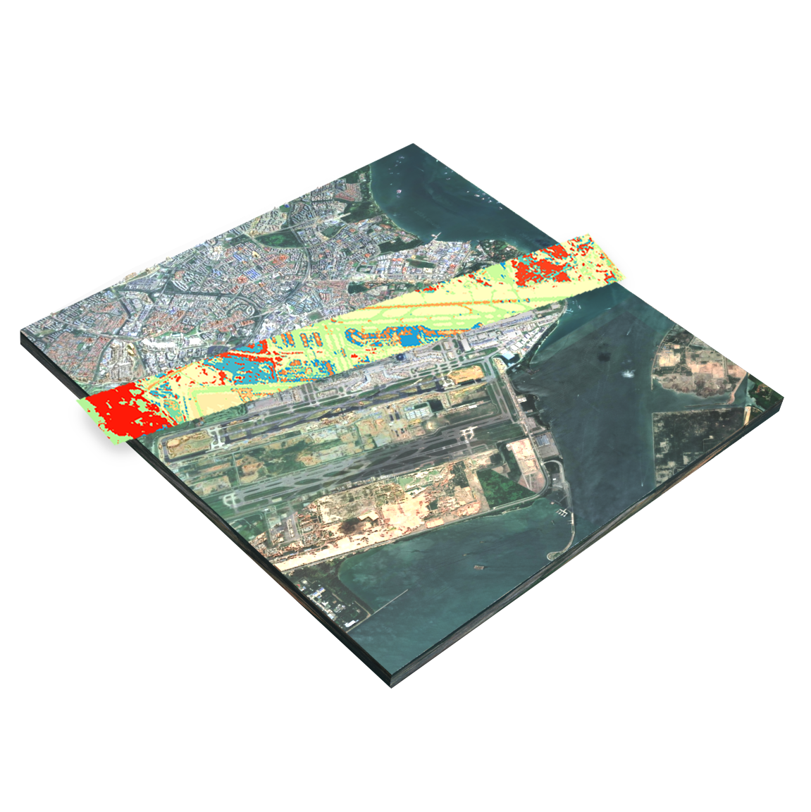
3D maps became one of OSK's most powerful communication tools. They were used across product marketing, investor pitch decks, sales presentations, and customer deliverables. By draping insights over custom made terrain models, the maps made abstract satellite intelligence immediately legible to non-technical audiences, turning raw spectral data into compelling stories, solutions, and relatable insights.
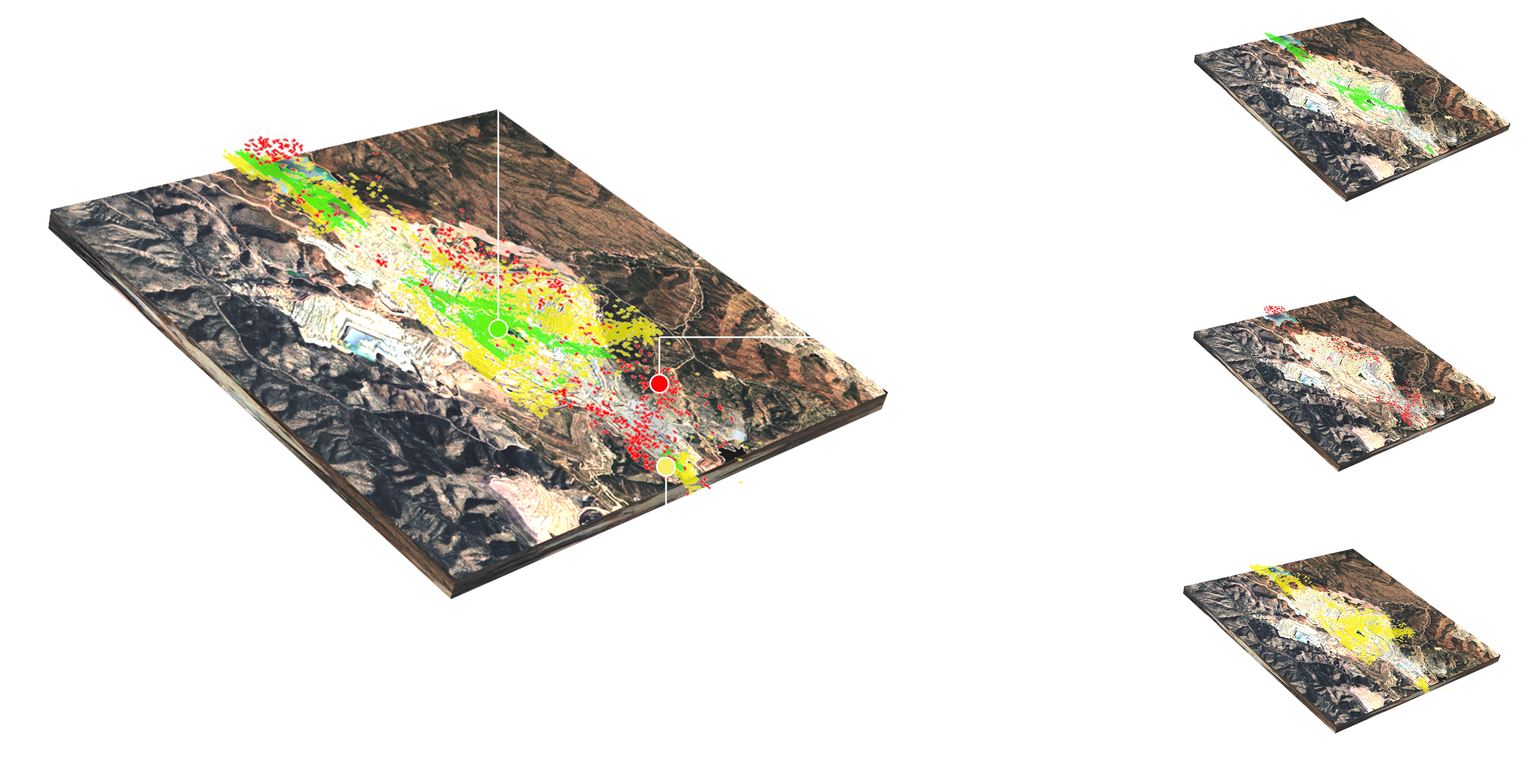
Mineral Use Case
The Chemistry of Earth
3D Layering employed for individual spectral classification layers (Sericite, Chlorite, Epidote) are separated from the composite 3D map and presented as distinct data layers. Used for client education, product storytelling, and internal design ideation around analytic visibility controls & the customer space we were servicing.
Understanding
Design Ideation!
3D Modeling also served as a design thinking tool. Helping customers & image specialists understand the maps and data in a 3-Dimensional space for the environment.
Interactive 3D Terrain
Explore the terrain models
These terrain models were derived from satellite elevation products and used in client presentations, scientific analysis, and storytelling around Orbital Sidekick's geographic coverage areas. Drag to orbit, scroll to zoom, use arrow keys to navigate.
SIGMA Platform
Maps inside the product
Within the SIGMA platform, maps weren't just outputs. They were the primary product surface. Every customer interaction with their data happened through the map. Designing the map system meant designing the experience of intelligence itself: how data appeared, how layers behaved, how users acted on what they saw in either an overlay or a symbol.
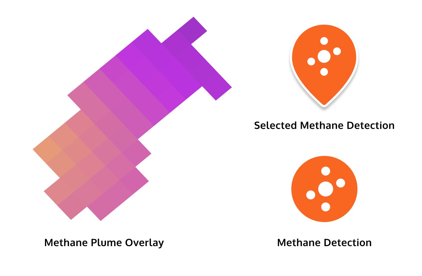
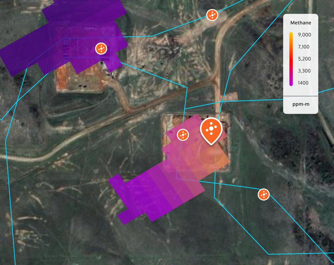
SIGMA Monitor — methane plume detection overlay, ROW shapefile corridor (cyan), and alert detection markers · ppm-m concentration scale
Layer Logic
How overlays, shapefiles & detections came together
Every map in SIGMA Monitor was built from four distinct layer types stacked in a deliberate order. Each layer served a specific purpose. The order was critical to legibility. Basemap first, giving spatial context. Heatmap above it, surfacing the spectral analytic data. ROW shapefiles on top, defining the customer's asset corridor. Alert and detection indicators at the highest layer, demanding immediate attention.
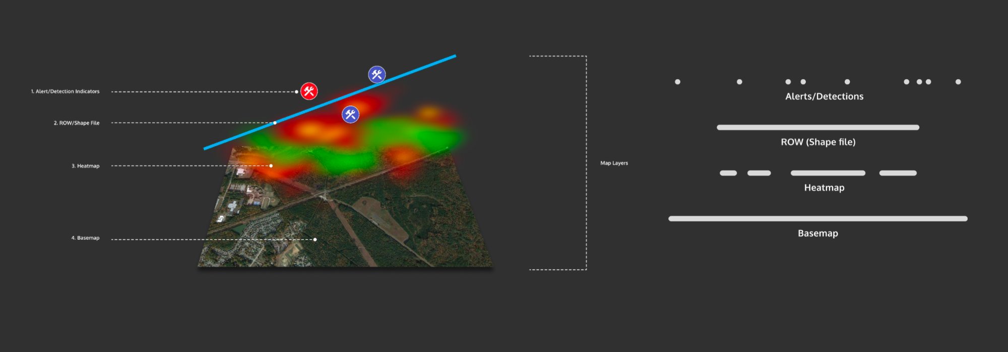
SIGMA Monitor map layer system. Alert/Detection Indicators · ROW Shapefile · Heatmap · Basemap. Layer ordering was critical to legibility and operator decision making.
Maps Everywhere
Mapbox RGB thumbnails across the product
Beyond the main map view, imagery appeared throughout the SIGMA UI as contextual references. RGB thumbnails, generated via Mapbox and supplied by OSK's data pipeline, surfaced inside order cards, data trays, alert lists, and tasking interfaces. Every data record had a place on the map.
%20in%20Sand.png)
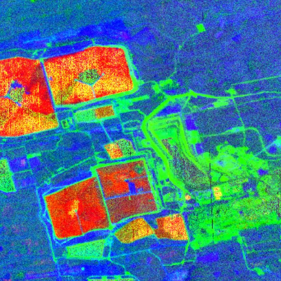
A representation of thumbnails in a SIGMA Data tray.
Examples of 2D Map Deliverables
What the System Produced
Together, these maps, standards, and storytelling elements allowed OSK to deliver high valuable industry insights to a variety of intelligence & commercial customers. The process identified industrial materials and substances of national security concern. It helped map alteration minerals tied to critical resources including lithium, copper, gold. And delivered visual detections of methane and leaks; stopping disasters before they happened.
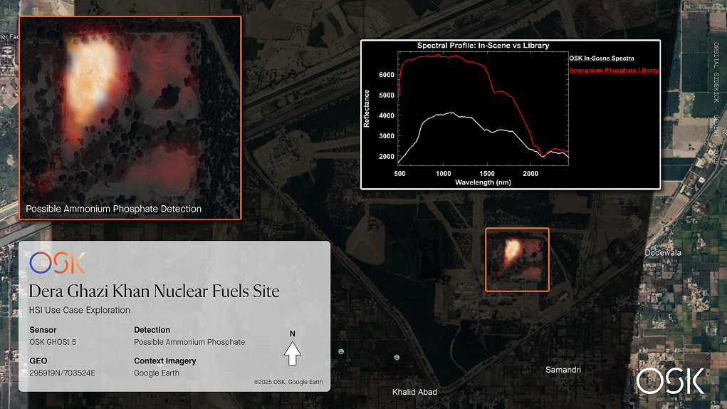
Map produced to showcase the identification of possible ammonium phosphate in Dera Ghazi Khan Nuclear Fuel Site.
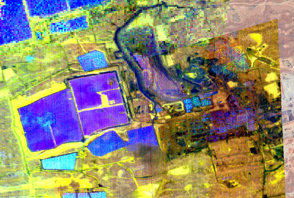
Map showcasing minerals in an Australian mine.

Map showcasing forest speciation.